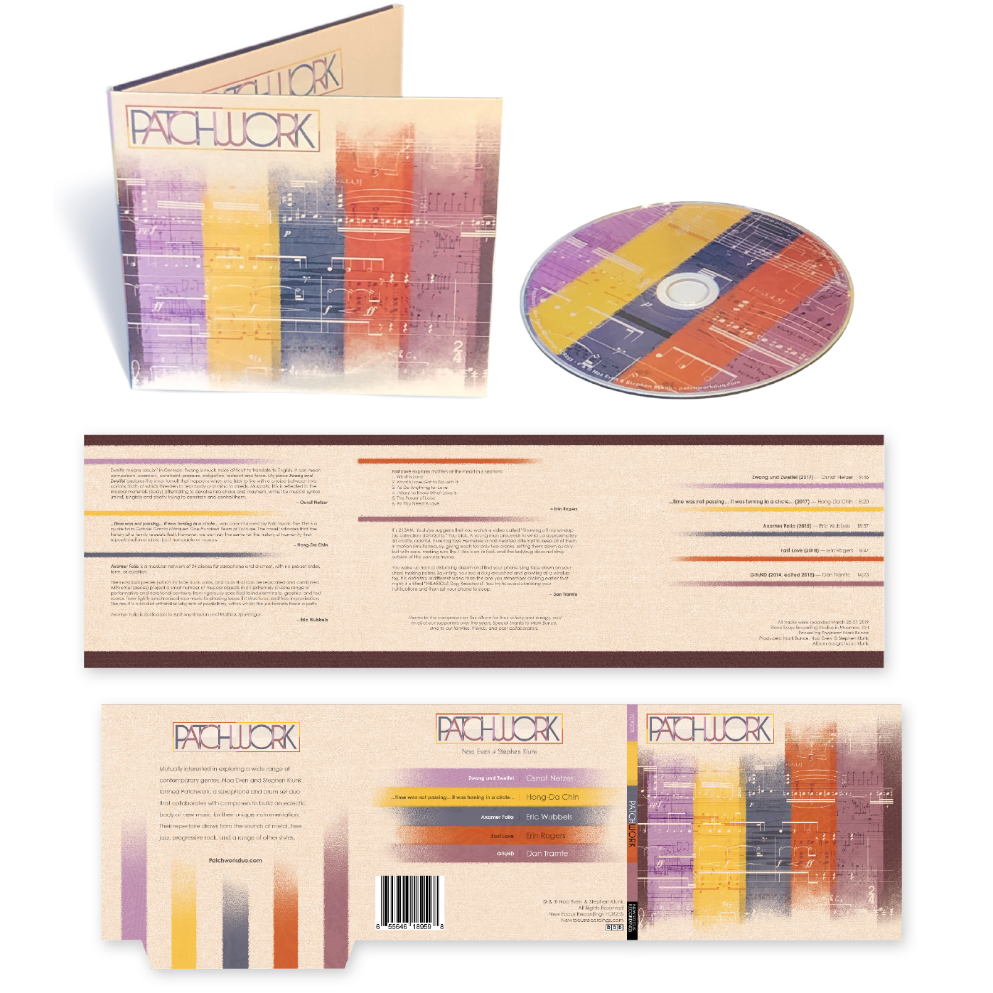
Album packaging for the self-titled album by Patchwork, a saxophone and drum new music duo based in Cleveland, Ohio.
Client: Patchwork
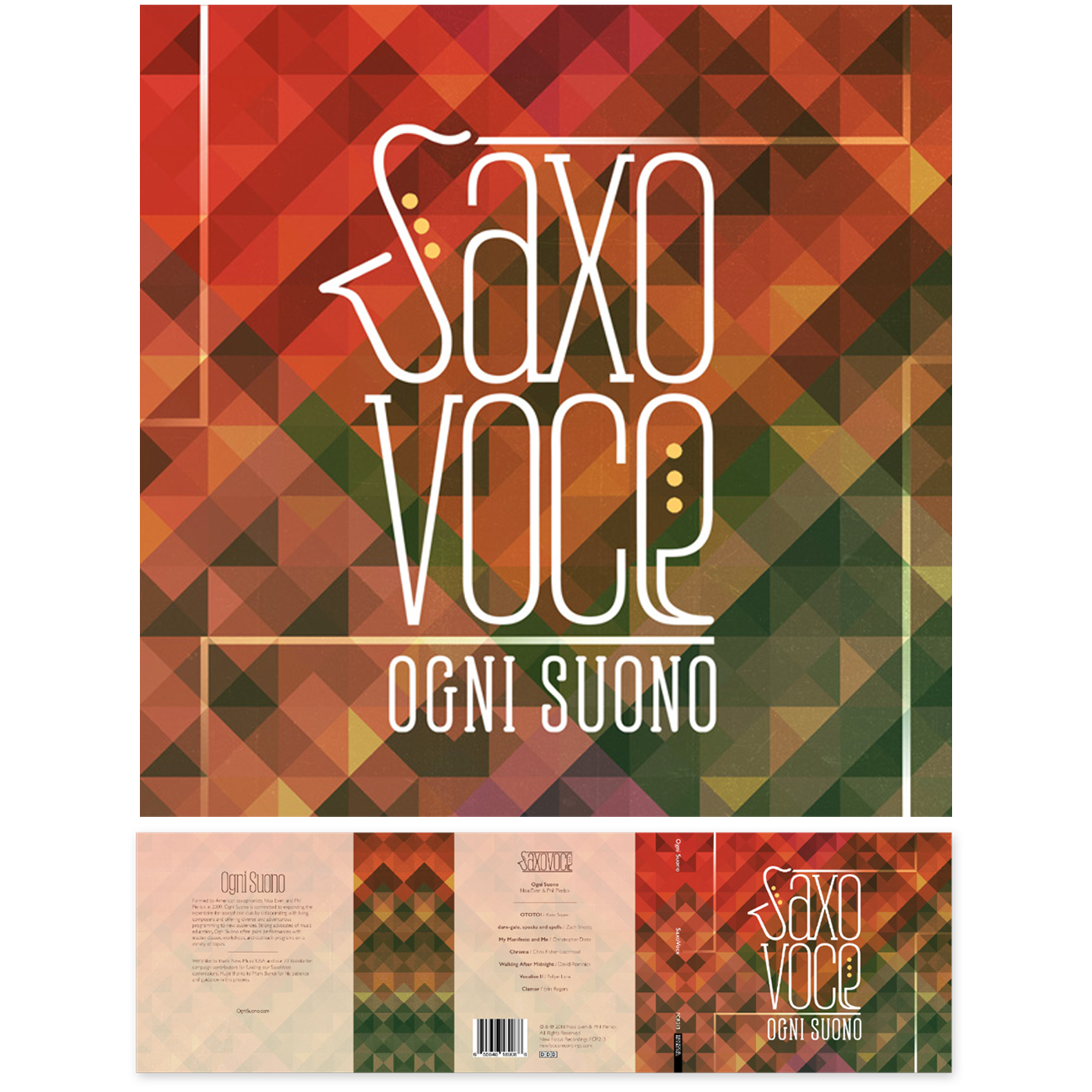
Album design for Saxovoce, a collection of works featuring a combination of vocals and saxophone by musical duo Ogni Suono.
Client: Ogni Suono

Applied Learning produces visual learning materials to help facilitate group learning sessions (both in-person and remote) for its client’s employees.
I was responsible for a complete overhaul of the company’s website, converting an imposing, text-heavy site into a rich, visually engaging one that better expressed the company’s offerings. View the full website here: www.appliedlearning.com
Client: Applied Learning
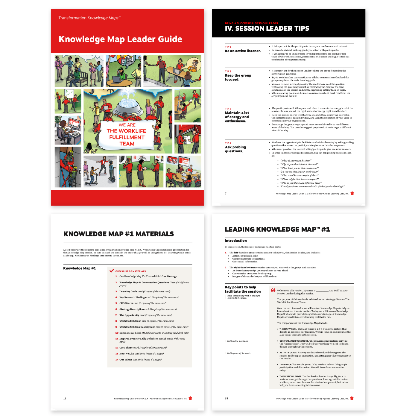
I regularly took responsibility for designing materials for Applied Learning’s in-person learning sessions, which utilize numerous print materials to facilitate discussion and education, such as a session leader’s guide booklet, discussion / activity cards, and occasionally promotional materials as well.
Pictured: cover and select pages from a 66-page learning session leader guide booklet designed and printed in 2019.
Client: Applied Learning
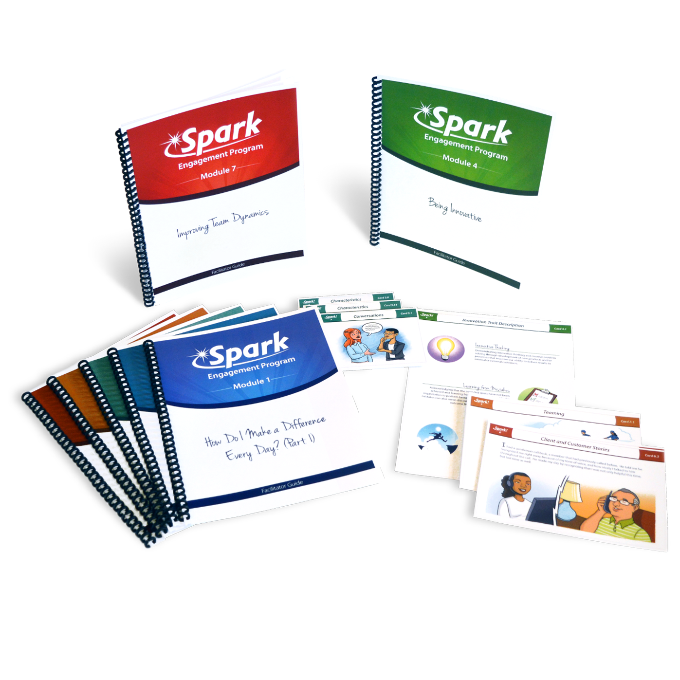
Spark! Discussion Starters are one of the learning products I developed at Applied Learning. These booklets contain facilitation instructions and discussion materials for a quick group learning-session-in-a-box.
I designed the basic Discussion Starter booklet template to be easily customizable, in order to fulfill clients’ unique needs and enable the delivery of on-point branding while maintaining its fundamental character and utility. A sample Spark! Discussion Starter that I fully designed and illustrated can be found here.
Client: Applied Learning
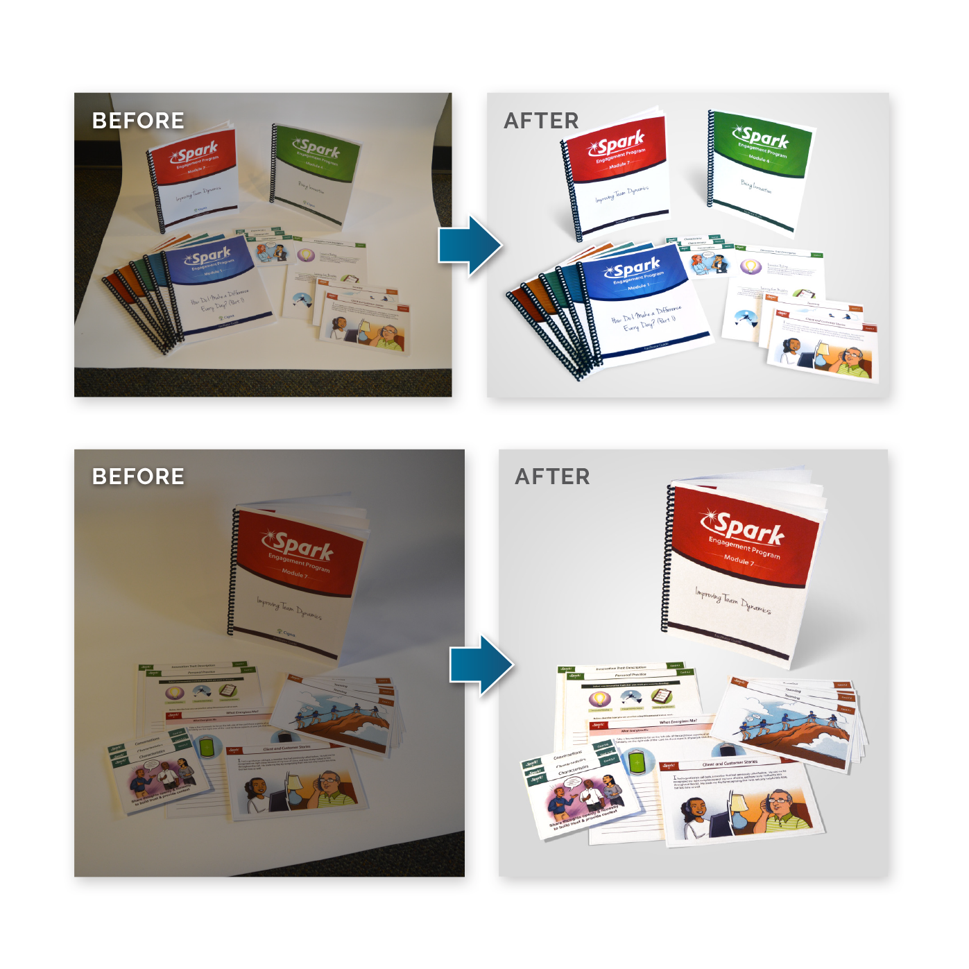
For projects where professional photography is not in the budget, a skilled photo editor can sometimes prove just as valuable. The photos on this page were taken using an iPhone 6, then cleaned up and adjusted for use as product shots in marketing materials.
Client: Applied Learning
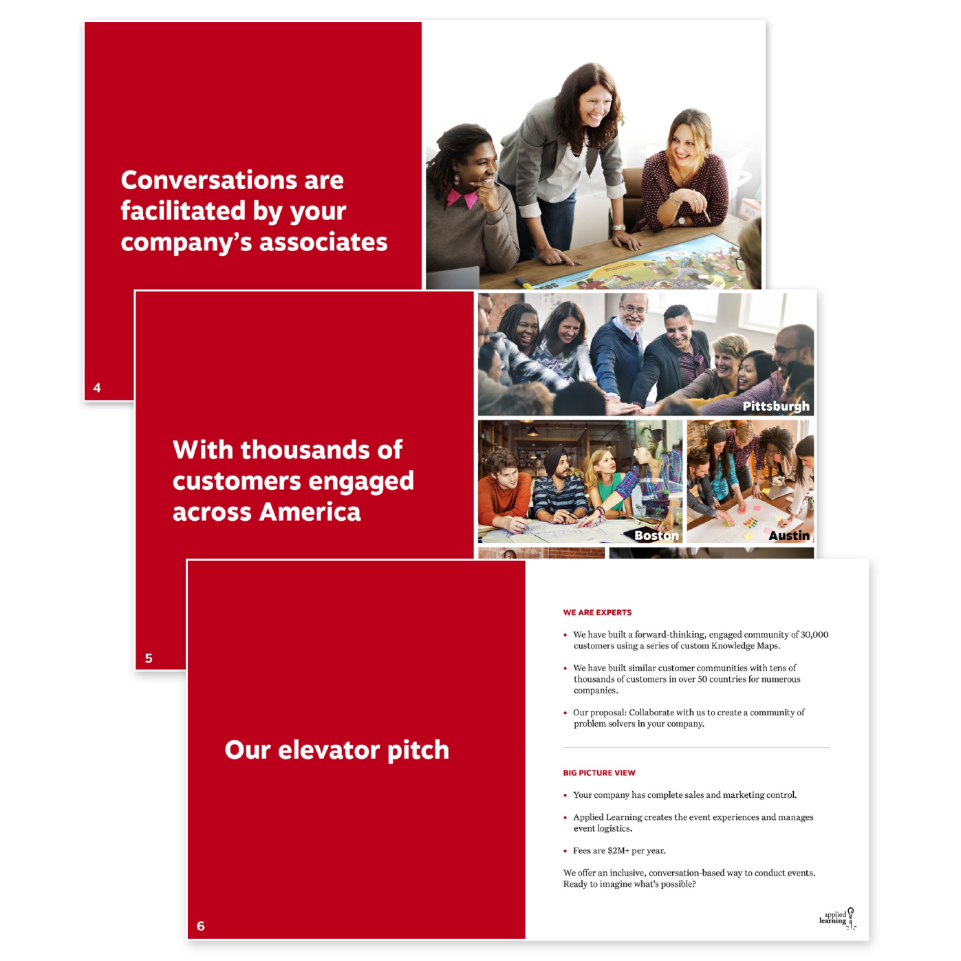
I regularly produced pitch materials—often in the form of digital PDFs or Powerpoint documents—to explain the company’s solutions to current or prospective clients. These documents frequently involved utilizing the clients’ brand guideline documents to create a familiar look and demonstrate our ability to produce professional, on-brand materials.
Client: Applied Learning
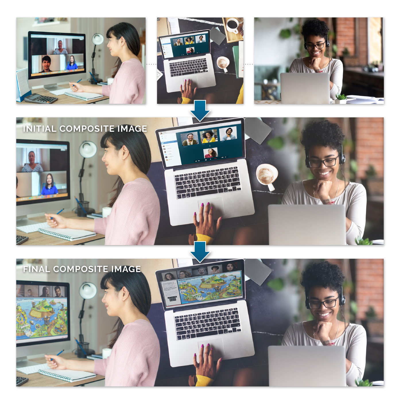
Though marketing and advertising materials often require showing off products in their natural environment—group learning meetings—corporate privacy and budget concerns can both create obstacles to arranging live photography sessions.
Creating seamless composite images, retouching photography, and manipulating imagery to make it more aesthetically pleasing, focused, or pertinent to a company’s work is one of my specialties.
Client: Applied Learning
Conveying ideas instantly and imbuing them with a sense of fun is key to effectively communicating the lessons Applied Learning is hired to teach, and to ensuring that learners retained them.
I’ve created visual iconography for numerous different projects and in numerous styles over the years—some to convey a more professional tone, and others to emphasize the feeling of play and exploration vital to engage group participants.
Client: Applied Learning

HealthyIQ produces digital learning materials focused on the US healthcare industry. I was responsible for developing the illustration style that came to define the HealthyIQ look.
Client: HealthyIQ
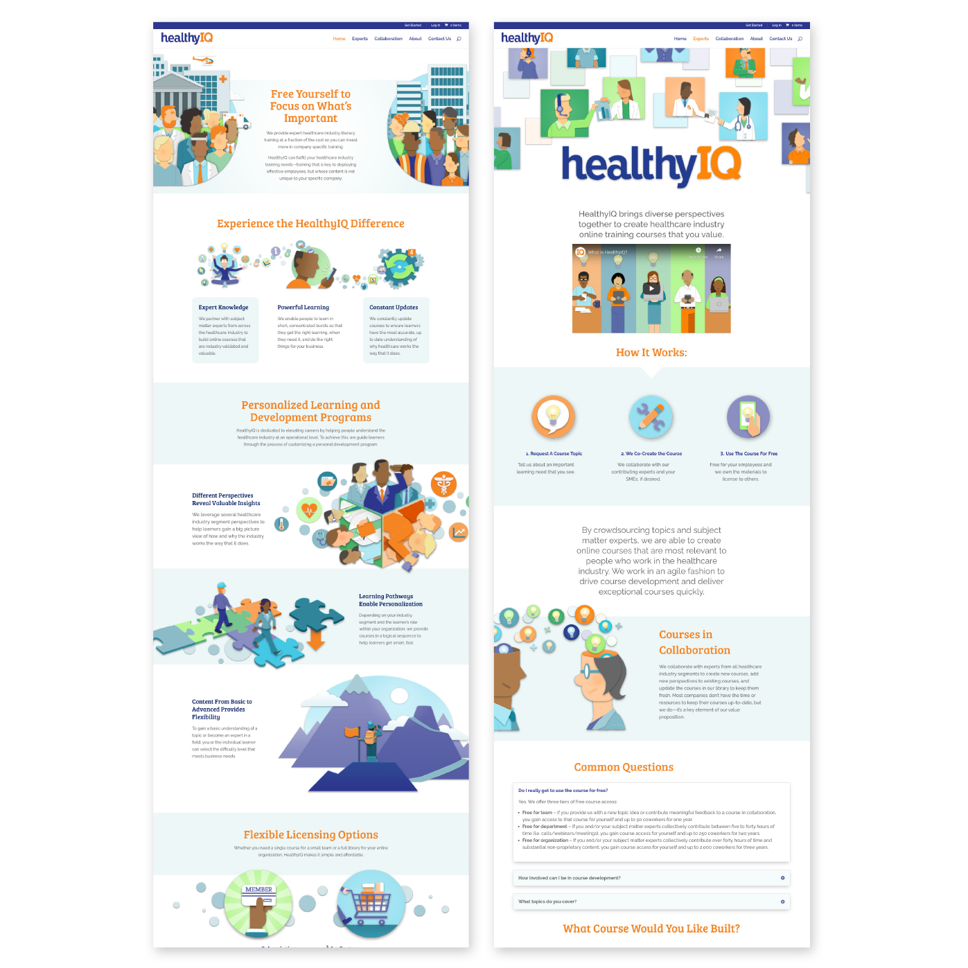
HealthyIQ produces digital learning materials focused on the US healthcare industry. I was responsible for the UX development, design, and coding of the company’s website, as well as in developing the illustration style that came to define the HealthyIQ look.
View the full website here: www.HealthyIQ.com
Client: HealthyIQ

Print materials, including floor banners for promotional use at tech conferences and flyers for distribution to sales prospects.
Client: Metaphor

Logo for Ready, Set... Train!, a northwest Ohio-based dog training and behavior business.
Client: Ready, Set… Train!
Logo (full color and one-color variant) for CUSP (Cleveland Uncommon Sound Project), a non-profit organization dedicated to facilitating the creation and performance of new music in northeast Ohio.
Client: Cleveland Uncommon Sound Project

Logo (full color and one-color variant) for Re:Sound, a new and experimental music festival held annually in Cleveland.
Client: Cleveland Uncommon Sound Project


Album packaging for the self-titled album by Patchwork, a saxophone and drum new music duo based in Cleveland, Ohio.
Client: Patchwork
Album design for Saxovoce, a collection of works featuring a combination of vocals and saxophone by musical duo Ogni Suono.
Client: Ogni Suono
Applied Learning produces visual learning materials to help facilitate group learning sessions (both in-person and remote) for its client’s employees.
I was responsible for a complete overhaul of the company’s website, converting an imposing, text-heavy site into a rich, visually engaging one that better expressed the company’s offerings. View the full website here: www.appliedlearning.com
Client: Applied Learning
I regularly took responsibility for designing materials for Applied Learning’s in-person learning sessions, which utilize numerous print materials to facilitate discussion and education, such as a session leader’s guide booklet, discussion / activity cards, and occasionally promotional materials as well.
Pictured: cover and select pages from a 66-page learning session leader guide booklet designed and printed in 2019.
Client: Applied Learning
Spark! Discussion Starters are one of the learning products I developed at Applied Learning. These booklets contain facilitation instructions and discussion materials for a quick group learning-session-in-a-box.
I designed the basic Discussion Starter booklet template to be easily customizable, in order to fulfill clients’ unique needs and enable the delivery of on-point branding while maintaining its fundamental character and utility. A sample Spark! Discussion Starter that I fully designed and illustrated can be found here.
Client: Applied Learning
For projects where professional photography is not in the budget, a skilled photo editor can sometimes prove just as valuable. The photos on this page were taken using an iPhone 6, then cleaned up and adjusted for use as product shots in marketing materials.
Client: Applied Learning
I regularly produced pitch materials—often in the form of digital PDFs or Powerpoint documents—to explain the company’s solutions to current or prospective clients. These documents frequently involved utilizing the clients’ brand guideline documents to create a familiar look and demonstrate our ability to produce professional, on-brand materials.
Client: Applied Learning
Though marketing and advertising materials often require showing off products in their natural environment—group learning meetings—corporate privacy and budget concerns can both create obstacles to arranging live photography sessions.
Creating seamless composite images, retouching photography, and manipulating imagery to make it more aesthetically pleasing, focused, or pertinent to a company’s work is one of my specialties.
Client: Applied Learning
Conveying ideas instantly and imbuing them with a sense of fun is key to effectively communicating the lessons Applied Learning is hired to teach, and to ensuring that learners retained them.
I’ve created visual iconography for numerous different projects and in numerous styles over the years—some to convey a more professional tone, and others to emphasize the feeling of play and exploration vital to engage group participants.
Client: Applied Learning
HealthyIQ produces digital learning materials focused on the US healthcare industry. I was responsible for developing the illustration style that came to define the HealthyIQ look.
Client: HealthyIQ
HealthyIQ produces digital learning materials focused on the US healthcare industry. I was responsible for the UX development, design, and coding of the company’s website, as well as in developing the illustration style that came to define the HealthyIQ look.
View the full website here: www.HealthyIQ.com
Client: HealthyIQ
Print materials, including floor banners for promotional use at tech conferences and flyers for distribution to sales prospects.
Client: Metaphor
Logo for Ready, Set... Train!, a northwest Ohio-based dog training and behavior business.
Client: Ready, Set… Train!
Logo (full color and one-color variant) for CUSP (Cleveland Uncommon Sound Project), a non-profit organization dedicated to facilitating the creation and performance of new music in northeast Ohio.
Client: Cleveland Uncommon Sound Project
Logo (full color and one-color variant) for Re:Sound, a new and experimental music festival held annually in Cleveland.
Client: Cleveland Uncommon Sound Project
